The challenge
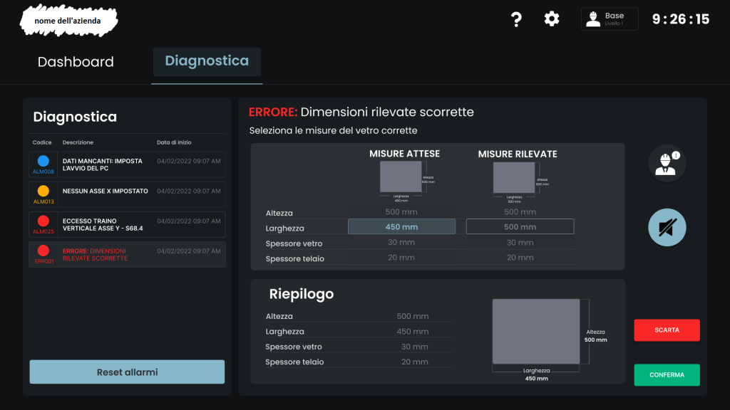
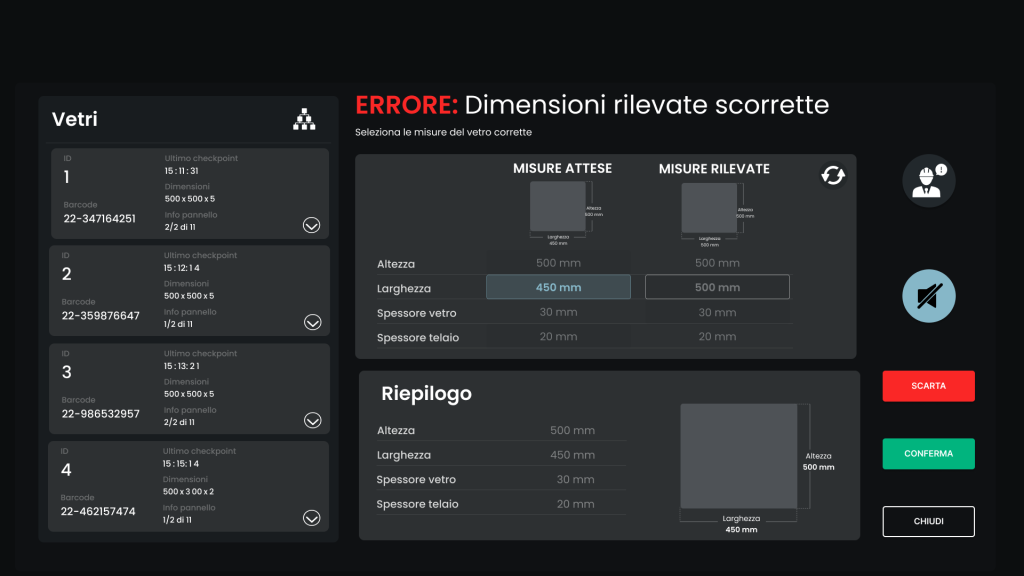
The company tasked us with improving the interface that controls the vertical grinder, a machine used to refine the edges of cut glass. On the main screen, or dashboard, there is a list of pending orders on the side, machine controls at the bottom, and in the center, visual representations of the glass panels: the one currently being processed and the next one in the queue. When an anomaly is detected, the machine alerts the operator with an error message on the screen along with a visual and acoustic alarm. The company asked us to make the screens, especially the error screens, more intuitive and understandable for both experienced operators and newcomers. They also wanted the interface to be modernized while preserving the meaningful color coding used for error messages and control buttons.
The company’s name, the original product of the machine, and the renewed dashboard
have been redacted as requested by the company.
Keeping the client’s request in mind, we also conducted on-site research and identified the main issue: the difficulty in understanding how to resolve detected errors quickly in order to avoid halting the entire industrial process. The team therefore focused on information architecture, aiming to group and present data following a clear priority structure:
- The error message is now visually prominent, and its type is immediately identifiable.
- Clear and immediate instructions on how to resolve it have been added.
- The characteristics of each glass pane are now grouped and separated with rectangles to avoid confusion.
- Buttons have been redesigned to stand out more, using meaningful colors that contrast well with the dark background.
Lastly, based on feedback from operators, and later appreciated by the client, we added a new feature: a section called “Diagnostics”, dedicated to all errors that occurred throughout the day, sorted in chronological order. This proves useful when checks and reviews are needed.
The renewed interface
Honorable Mention
The most complex interface to design
The resources
The process
The client’s request
In the first phase, there was a kick-off meeting with the client, who asked us to simplify and make the interface more intuitive and user-friendly for both experienced staff and newcomers.
Heuristic evaluation
The interface was initially subjected to a heuristic evaluation to identify the main violations of design standards.
User testing and field observation
Next, we visited the company to observe how different operators use the interface in real-life situations. These operators also performed a usability test with the original interface and were interviewed afterward. This helped us identify any issues that needed to be addressed in the interface.
Prototype
After gathering all the feedback, the interface was redesigned, and a prototype was created using Figma.