The challenge
The client tasked us with improving the interface of the application that controls the Zerobody, a water bed designed for relaxation and mindfulness sessions. The controls are primarily divided into two types: the controls for adjusting the bed (raising or lowering it, changing the lights, turning on the bubbles) and the controls for setting the session (mode, duration, volume). In particular, the company asked us to modernize the style of the application while maintaining a visual language based mostly on icons, to make it intuitive and globally accessible, without the need to change the language.
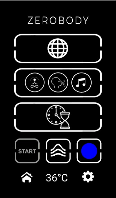
The original interface
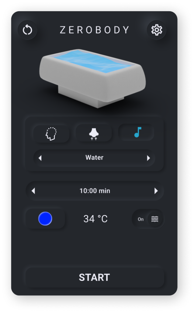
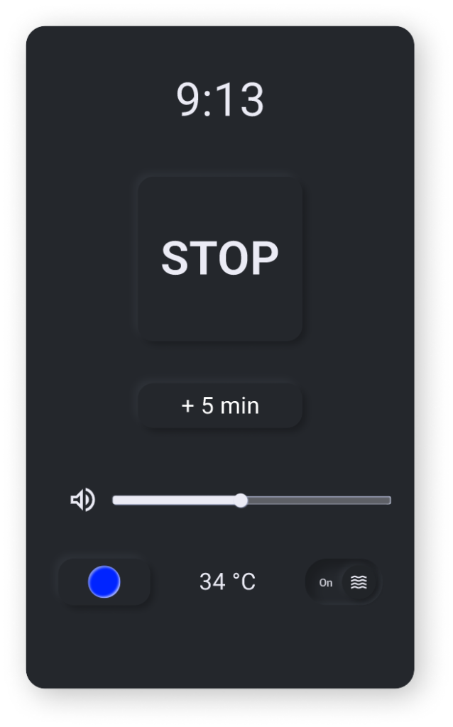
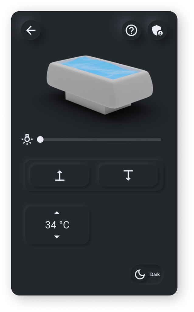
The renewed interface
Honorable Mention
The most visually beautiful interface
The resources
The process
The client’s request
In the first phase, there was the kick-off meeting with the client, who asked us to modernize the interface while maintaining the use of icons and avoiding text, in order to make the product usable worldwide without the need for language changes.
Reverse sprint and user testing
With the reverse sprint, the outdated interface was tested with users to gather any issues to be addressed. Feedback revealed that the icons were not intuitive, and the overall aesthetics did not convey a sense of tranquility and modernity.
Designing the solution
Using user feedback as a foundation and the limitations set by the client, sketches were created, and the best ones were subsequently selected.
Prototype
In the final phase, the prototype was created using Figma and an online library of components and icons.